A Busy Day in Portland:
Jun 8, 2015
May 17, 2015
Apr 29, 2015
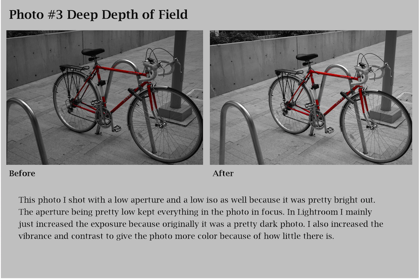
Project 10 Full Magazine
Cover:

First Story Cover:


Page 3-4 of First Story:
Page 5-6 of First Story:

Second Story and ad:
Back Page:

Apr 11, 2015
Project 09 Two Portraits
Portraits
Commercial:

This commercial portrait is based on Rolling Stone magazine. I used the basic things the magazines have like a close up of the subject and multi color text. Just to give it even more effect I added a barcode. The picture itself I firsted turned black and white then I cropped and edited the light to get an overall plan and simple feel. I did this so the subject was inviting but not overpowering.

This is another commercial portrait I made in to a magazine called Hydration Magazine. The main subject relates to the article and is hydrate so she will not die.
Fine Art:

I used this photo as an example of a fine art photo because it is in portrait format and isn't advertising any product. I first turned it black and white and then cropped it to a suitable size. Lastly i edited small things like shadows and glare.

I chose this portrait because I think it is a good example of fine art portraits. I edited this photo by first cropping next I added the vignette and lastly I made it more caryotype to give a old look.
Apr 1, 2015
Commercial and Fine Art Pre Work
Fine Art Portraits:

By Steve McCurry

By Gregor L.
I chose these two photos because they both have different feels to them but still are very similar. I chose the first because its an iconic photo that depicts an Afghan girl struggling through war. The second one is not so well known but is a beautiful image that really has a strong mood.
Magazine Covers:

Photo By: Mark Seliger

By Scott Dadich
I chose these to magazine covers because they both have strong iconic subjects and have strong feel. The first one of Jennifer Lawrence is a beautiful picture of her and has interesting editing to give it a warm emotional feel. The second of Edward Snowden is the polar opposite of the one of Jennifer Lawrence because it is cooled and has a pretty ironic feel because has holding the flag. But I think its still an incredibly strong message in its simplicity.
Project 8 Surrealism and Photomontage
Bulbs to the World

This photo took a while to make I used the cattails as if they were light bulbs and put light bulb shapes over them. Next I cropped out the inside of the bulbs to make it so I could put pictures underneath them. I think it turned out well especially the ones on the far left and far right because they both have strong contrast in color to the main background. I made this photo because the way I did because I thought it had an interesting aesthetic and because I thought it was a creative way to put together multiple images.
Mar 31, 2015
Surrealism and Photomontage Examples

By Salvador Dali

By Jerry Uelsmann
Surrealist photography is more creative and abstract photography that conveys a story or idea through the content in the image. It started in the mid 1920s trying to explore what they could convey through photography.
Mar 9, 2015
Project 7 - Alternative Process through Digital Means
Bromoil Prints:
A bromoil print was an early twentieth century photographic processes that created photos that resembled paintings but also where more detailed. I created mine by editing a photo in lightroom. The biggest things I did was turned it almost sepia and added grain to give it a old aged feel. Next I added a painting border to the outside to give it painting feel.

⇑After⇑
⇓Before⇓

Daguerreotype:
A daguerreotype is a old photo process that photographers printed the photo onto a piece of silver or copper. I made my daguerreotype by editing this photo of Nigle into the theme of daguerreotypes. I first turned the photo more sepia colored and made it a little less vibrant and clear. After that I layered on a couple textures that turned out pretty well. Lastly I added the border.
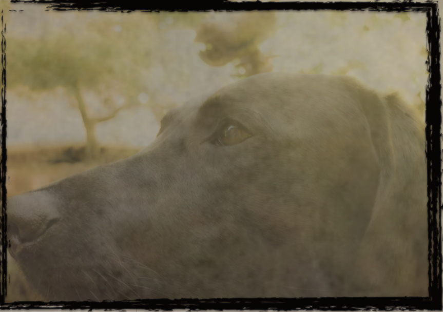
⇑After⇑
⇓Before⇓

Cyanotype:
Cyanotype process is a process in the mid 20th century used to create copies of many pictures and drawings. It was cheap and created a cyan blue hue over the entire picture. To make my photo I tried to make it as blue as I could but not to blue as to get rid of the rest of the photos content. After that I made it blurred and added grain. Lastly I added the border.

⇑After⇑
⇓Before⇓

Feb 23, 2015
Project 6 - Multiple Image Techniques
Multiple Exposure:
I chose this photo because I though it had a nice compliment between the smoke stacks being very urban and having the mountain behind it being very natural. I also thought it was a cool looking image having cables that hold the towers up sort of mimic the triangular shape of the mountain giving it a interesting aesthetic.

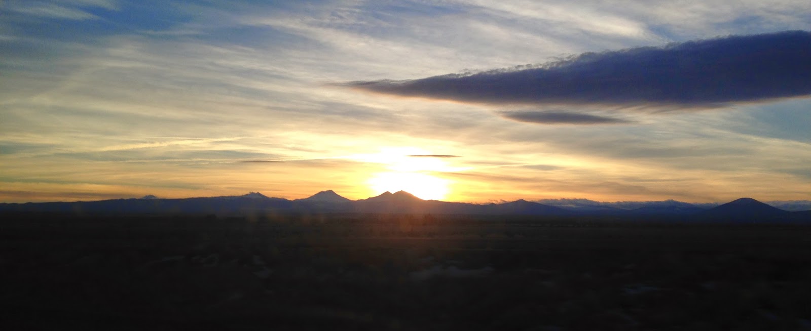
Panorama:
I chose this panorama because I thought it was a cool image of the Three Sisters with the sun behind them. I created the image by sticking a couple images together in photoshop.
HDR Image:
This is a photo of the Three Sisters and Broken Top for the top of Mt.Bachelor. I didn't take multiple images to create the HDR image I edited it to give it the feel of a HDR image and I think it turned out well. I think the photo is interesting because of the details in the Sisters it gives it an intense feel.

Jan 27, 2015

Jan 15, 2015


Subscribe to:
Comments (Atom)