Bromoil Prints:
A bromoil print was an early twentieth century photographic processes that created photos that resembled paintings but also where more detailed. I created mine by editing a photo in lightroom. The biggest things I did was turned it almost sepia and added grain to give it a old aged feel. Next I added a painting border to the outside to give it painting feel.

⇑After⇑
⇓Before⇓

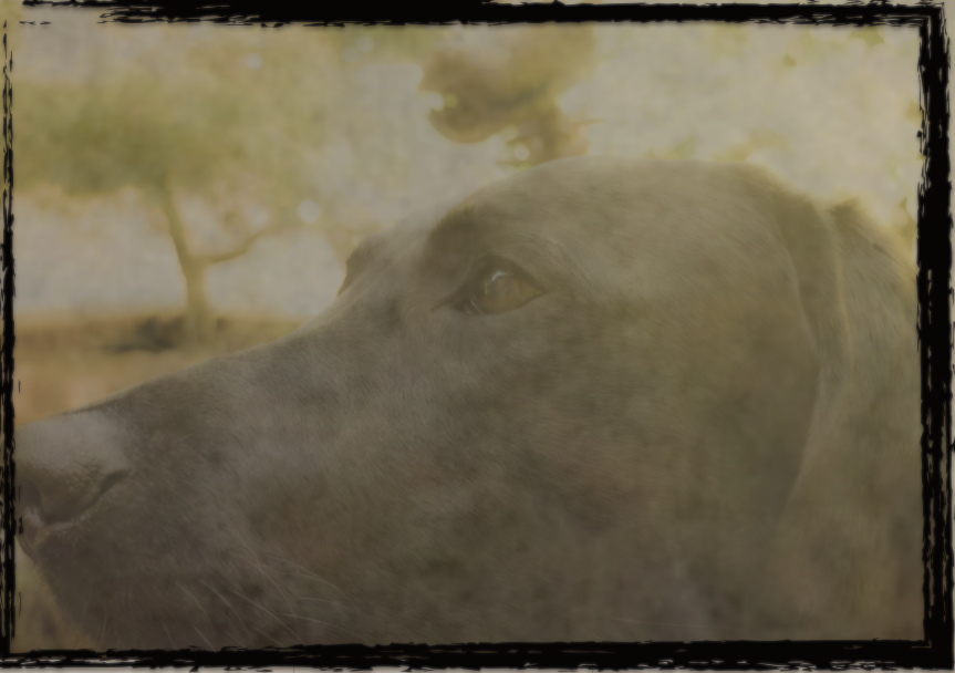
Daguerreotype:
A daguerreotype is a old photo process that photographers printed the photo onto a piece of silver or copper. I made my daguerreotype by editing this photo of Nigle into the theme of daguerreotypes. I first turned the photo more sepia colored and made it a little less vibrant and clear. After that I layered on a couple textures that turned out pretty well. Lastly I added the border.
⇑After⇑
⇓Before⇓

Cyanotype:
Cyanotype process is a process in the mid 20th century used to create copies of many pictures and drawings. It was cheap and created a cyan blue hue over the entire picture. To make my photo I tried to make it as blue as I could but not to blue as to get rid of the rest of the photos content. After that I made it blurred and added grain. Lastly I added the border.

⇑After⇑
⇓Before⇓